Jobs Friday is here again. The first Friday of every month brings us the widely-anticipated report by the Bureau of Labor Statistics on the health of the US labor market.
It’s a useful set of data for showing us what sectors of the economy are adding more jobs, how many people with part-time work are actively looking for full-time jobs, the extent to which hourly wages are keeping up with inflation (pretty well these days, actually) and so on.
What the jobs report does not do, no matter how many talking heads on the financial news shows may tell you otherwise, is say anything about where the economy is headed. The predictive power of the BLS and other labor market reports, for all their usefulness otherwise, is roughly zero.
Looking Backward
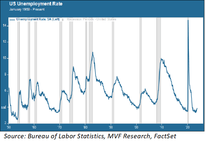
The chart below shows the US unemployment rate going all the way back to 1950. The gray columns represent recessionary periods.

Each of these recessions had its own unique set of features – to paraphrase Tolstoy, every unhappy economy is unhappy in its own special way. But one thing is common to each of them: the unemployment rate didn’t start to shoot up until after the recession had begun – and then it soared.
Which makes complete sense – companies don’t start laying off people in droves until business is already bad. If it’s bad across the whole economy, those layoffs will come quickly and in large numbers.
The unemployment rate can double in just a couple of months or so, as the chart shows. In the parlance of economists, unemployment is a lagging indicator. It tells us where we’ve been, not where we’re going.
Cooling Off
Looking backwards has its own uses, though. Here below, we show the unemployment rate combined with the change in nonfarm payrolls for the past three years.
What this chart tells us is that the labor market is cooling off, relative to where it was a year or two years ago. Again – this says nothing about whether we are heading into a recession or whether the economy will turn up again.
It says that payrolls are growing at a slower rate than they were (with obvious exceptions like last month’s barnstormer of nearly 300,000 adds), and the unemployment rate is ever so slowly rising off its recent lows (though the current rate of 3.9 percent is still quite low by historical standards, as the earlier chart illustrates.
This picture actually looks pretty good for the Fed, which is probably why stocks started rising and bond yields fell when the BLS report came out this morning.
For the Fed, a cooler jobs market suggests a higher likelihood of inflation continuing to moderate, meaning it can stop raising interest rates (which is how the market is reading it today).
Once again – nothing here is telling the Fed or anyone else what the economy will look like one month or six months from now. No predictive intelligence here. But if a moderately cooling economy is where we are today, that’s good enough for now.
Original Post
Editor’s Note: The summary bullets for this article were chosen by Seeking Alpha editors.
Read the full article here
